Monet Museum App
More informative and interactive museum app for museum lovers.
Overview
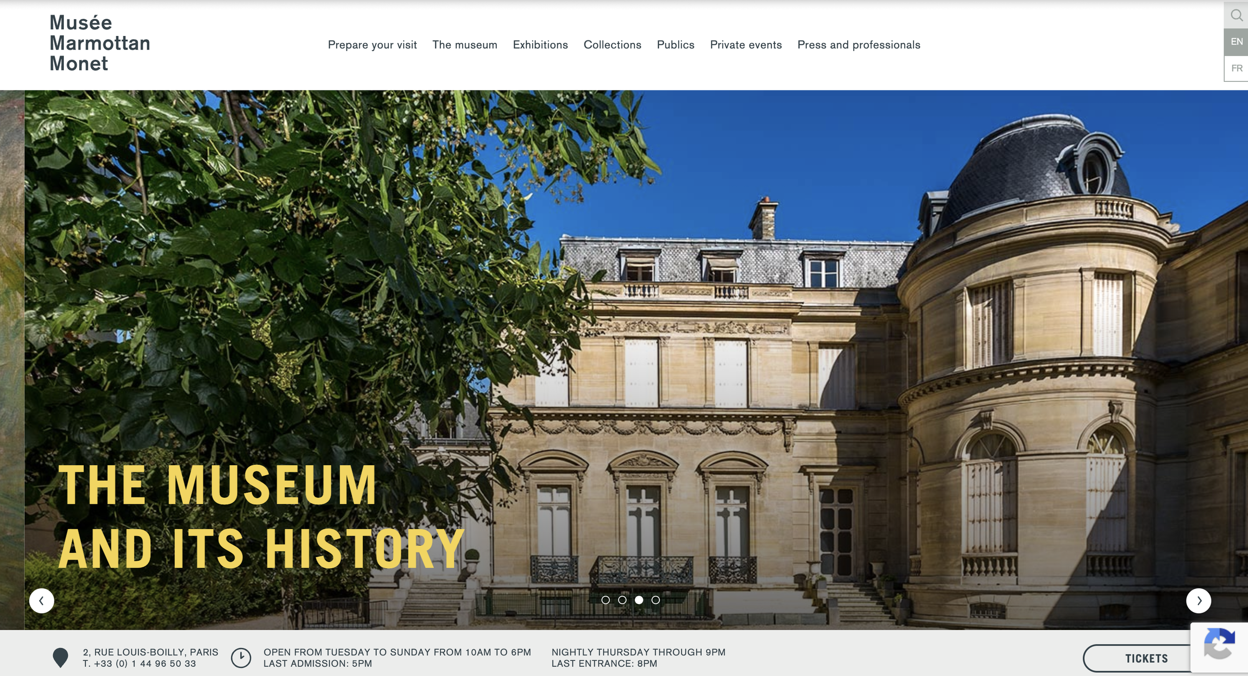
Current museum websites prioritize providing information about the museum, rather than inviting people to the art world.
I wanted to redesign a current museum website to let users enjoy art more by presenting artworks in a more engaging way.
Role
UX & Graphic Designer
Timeline
March - April, 2025
Tool
Figma
Why?
To make people’s lives more colorful
To make art accessible; art is not something that is only enjoyed by the privileged/bourgeoisie.
How?
Provide an immersive and fun experience of art to a wider audience.
Provide artists with a platform to present their work to the public easily.
Strategy
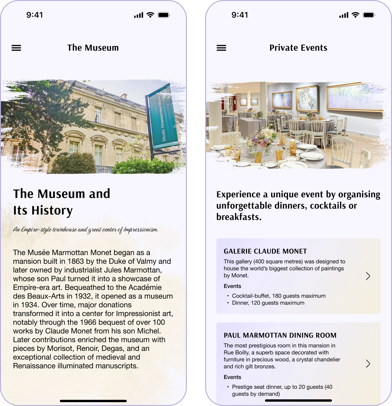
Utilize the “museum” aesthetic in order to make users feel they are exploring a museum.
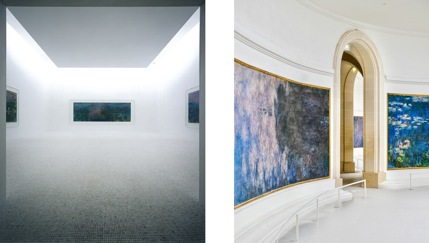
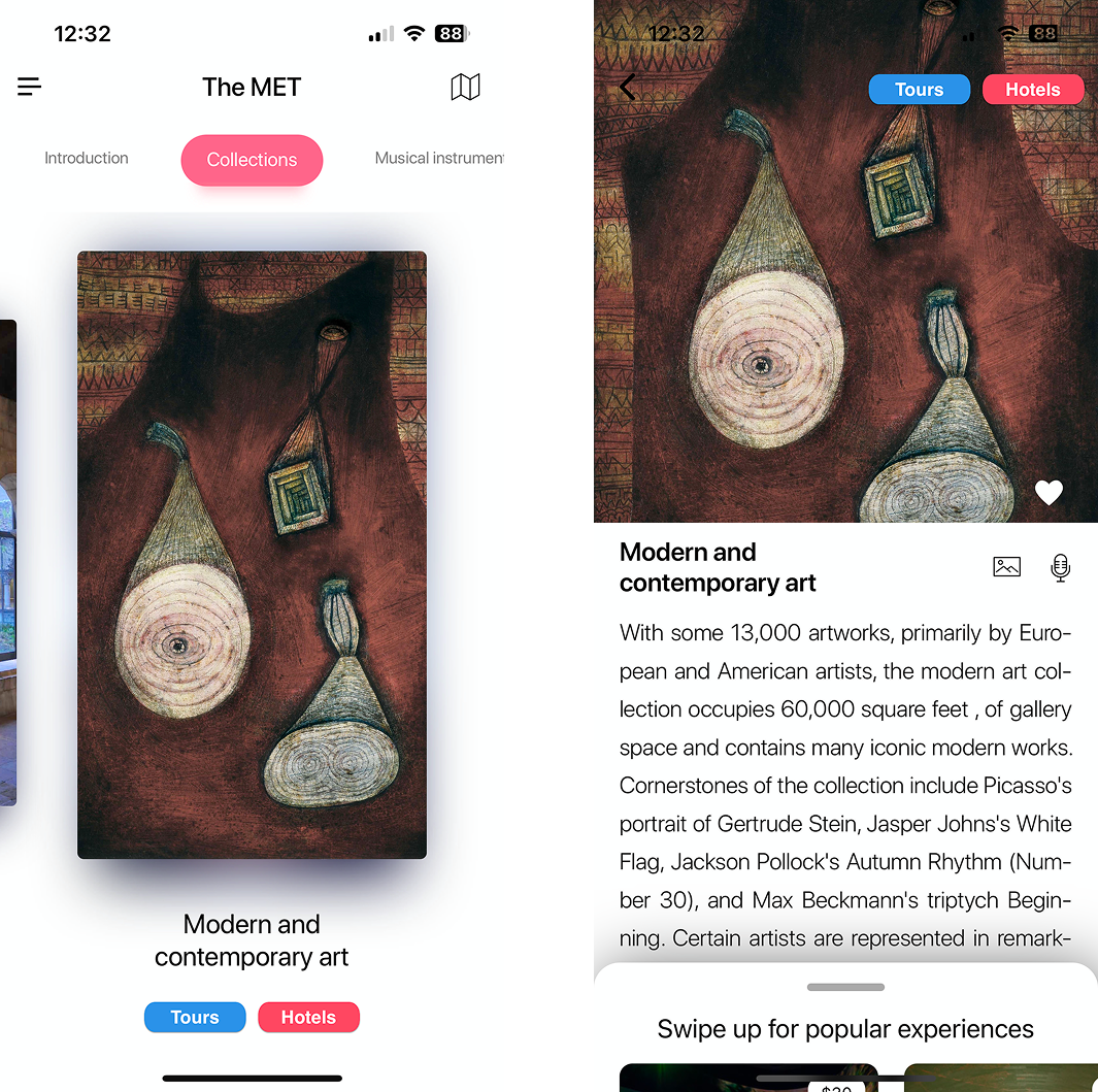
Reference current museum apps, such as MET; the app users carousel format to show artworks for visibility.
Also, the detailed page when you click the carousel image lets you explore more of the piece.
Product Design
Ideation
First, I came up with PC version, since users can view paintings in higher resolution with a bigger size, which is good for visibility.
Iteration
However, on second thought, I changed the format to a mobile app as mobile is more accessible and convenient for users nowadays.
Also, the Monet Museum Website does not have an app, meaning museum visitors could experience inconvenience.
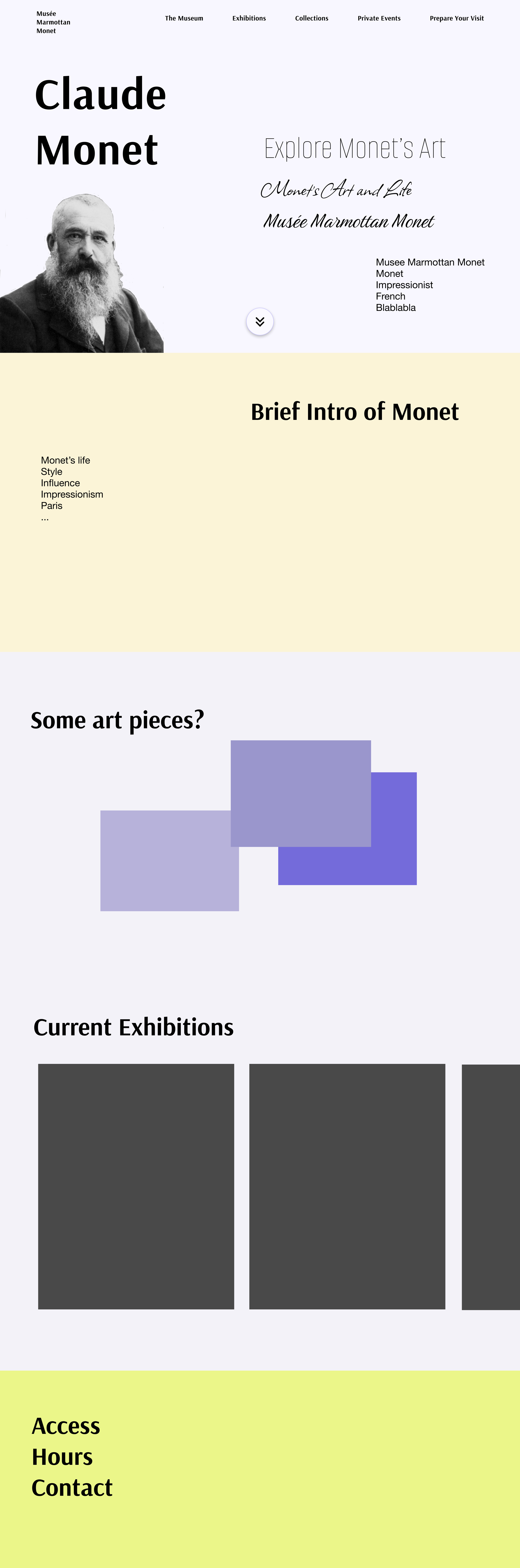
Design Concept
Keep the vibrant element (yellow color) of the current website, but add more subtle colors for a calm atmosphere that the app feels like an actual space where art pieces are.
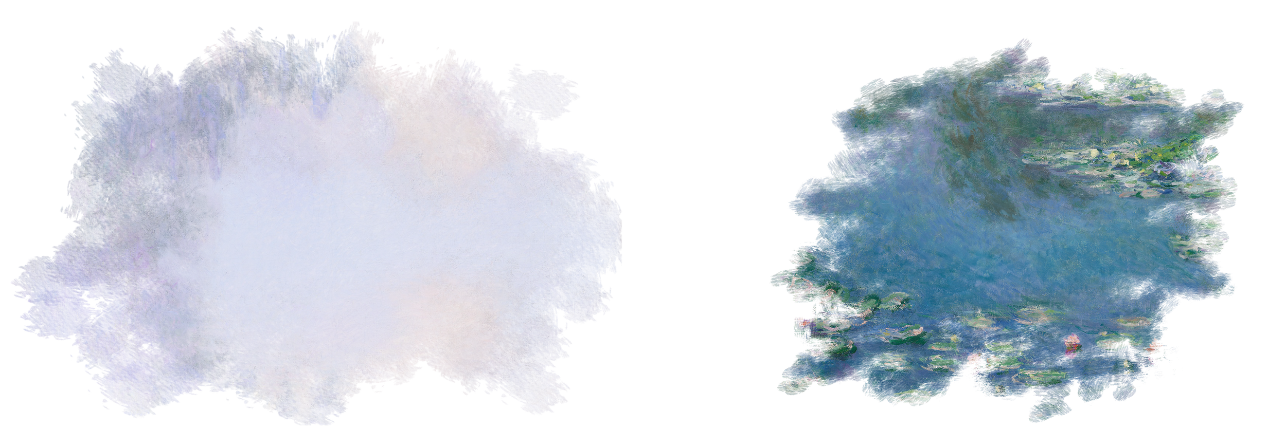
Use motifs from Monet’s art pieces and impressionist-style brush strokes to represent impressionism.
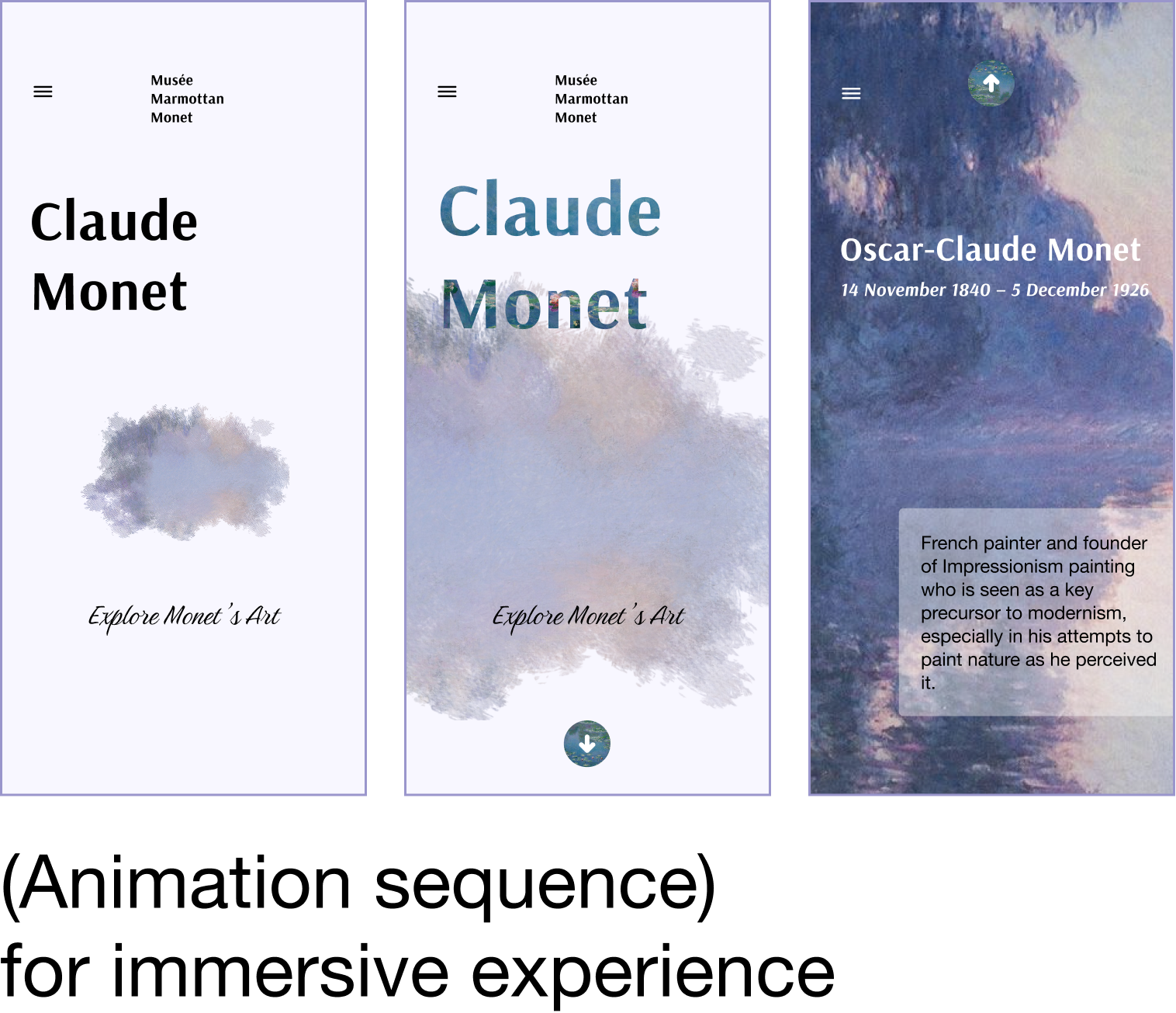
High-Fidelity Design v1
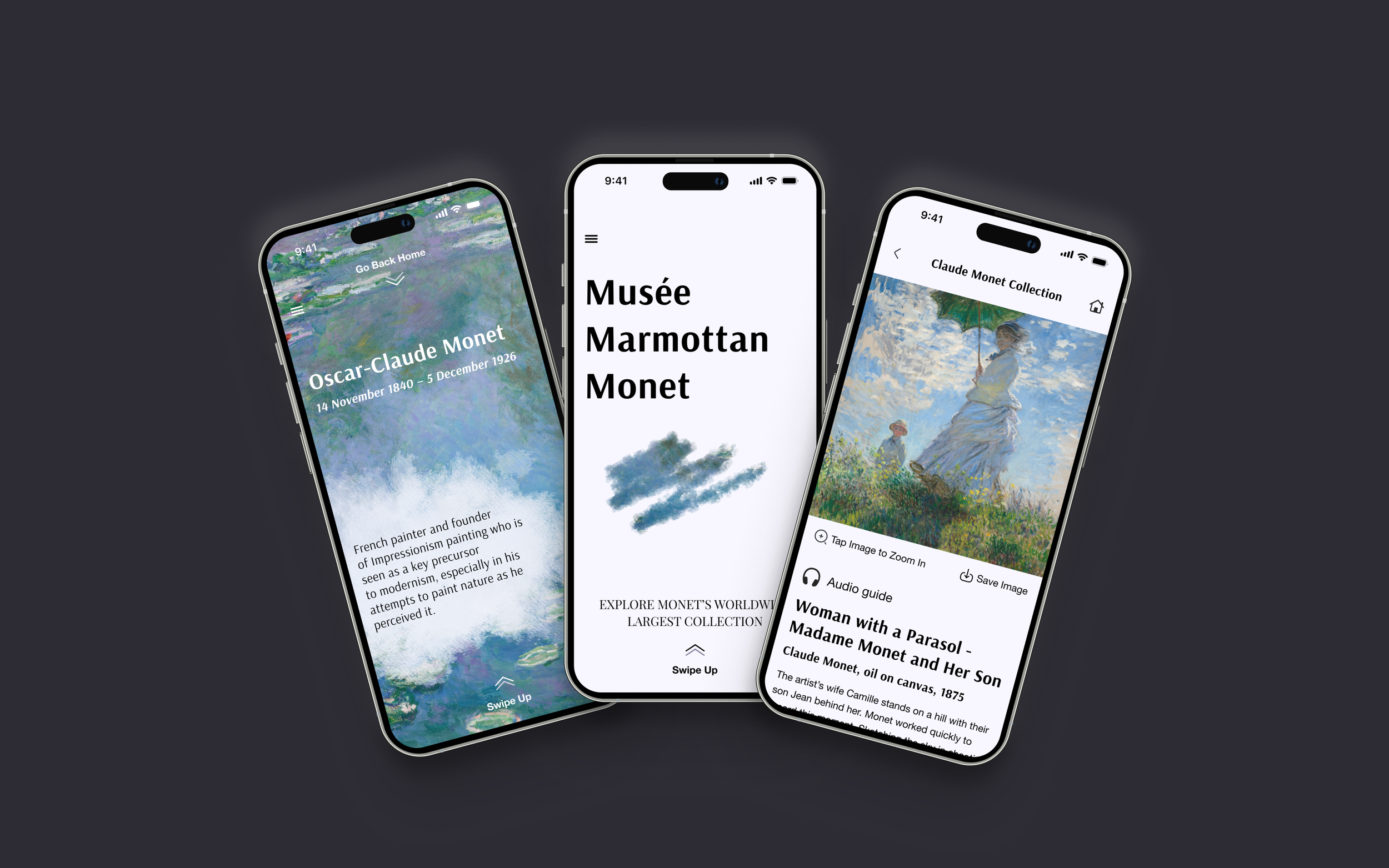
Used Monet’s art piece and motifs from it. For better interactiveness, added animation transition in the home screen.
Once a user swipes up, the brief introduction of Monet appears.
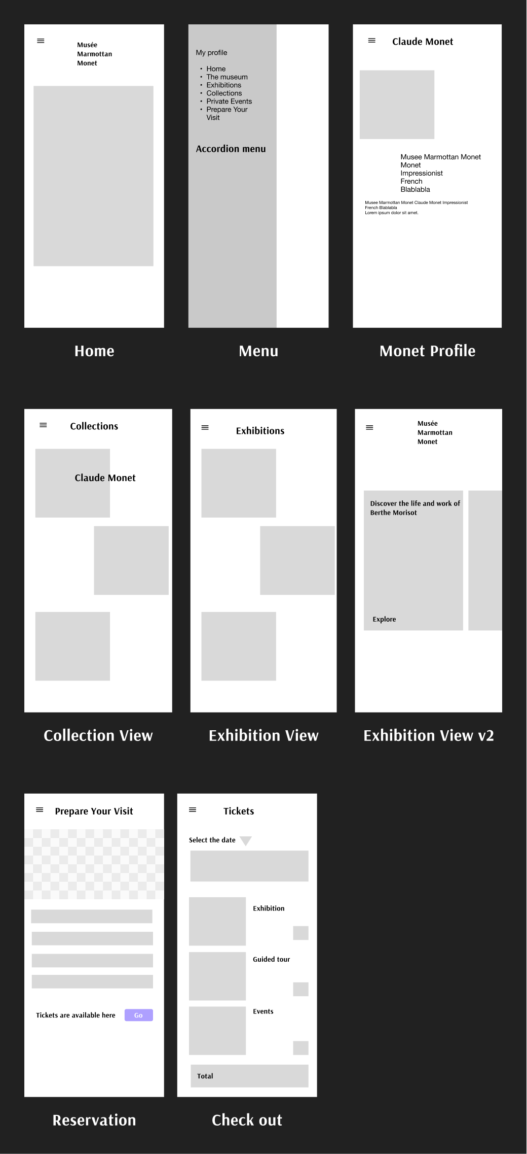
Final Design
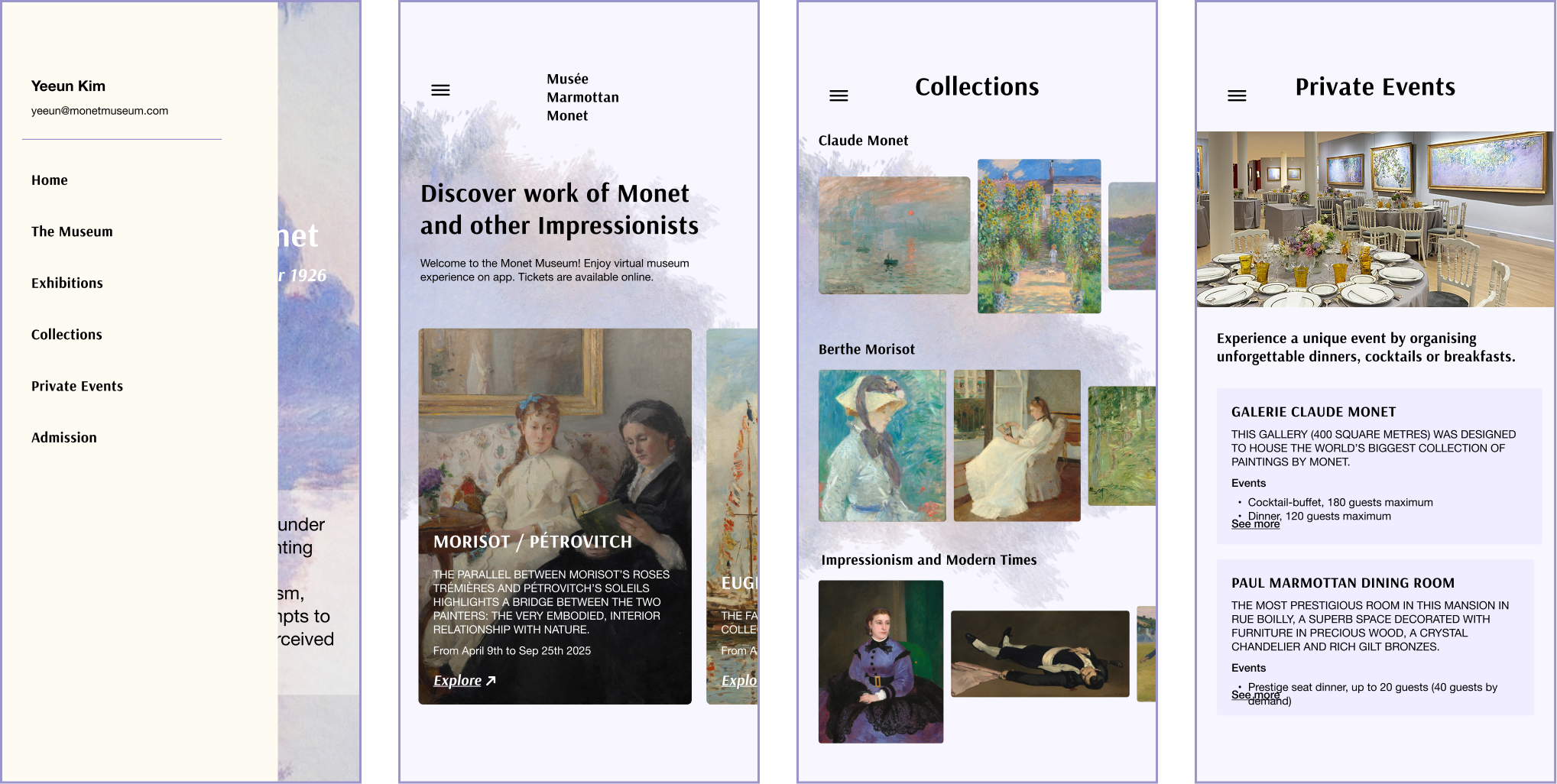
For the final design, I reflected on the feedback below from the professor and students.
The animation transition is not smooth
The artwork images in the Collection page are not visible enough
The yellow color for the slide bar menu doesn’t go along with the other colors
The design is not coherent - need to translate an element (a violet cloud) to a visual language
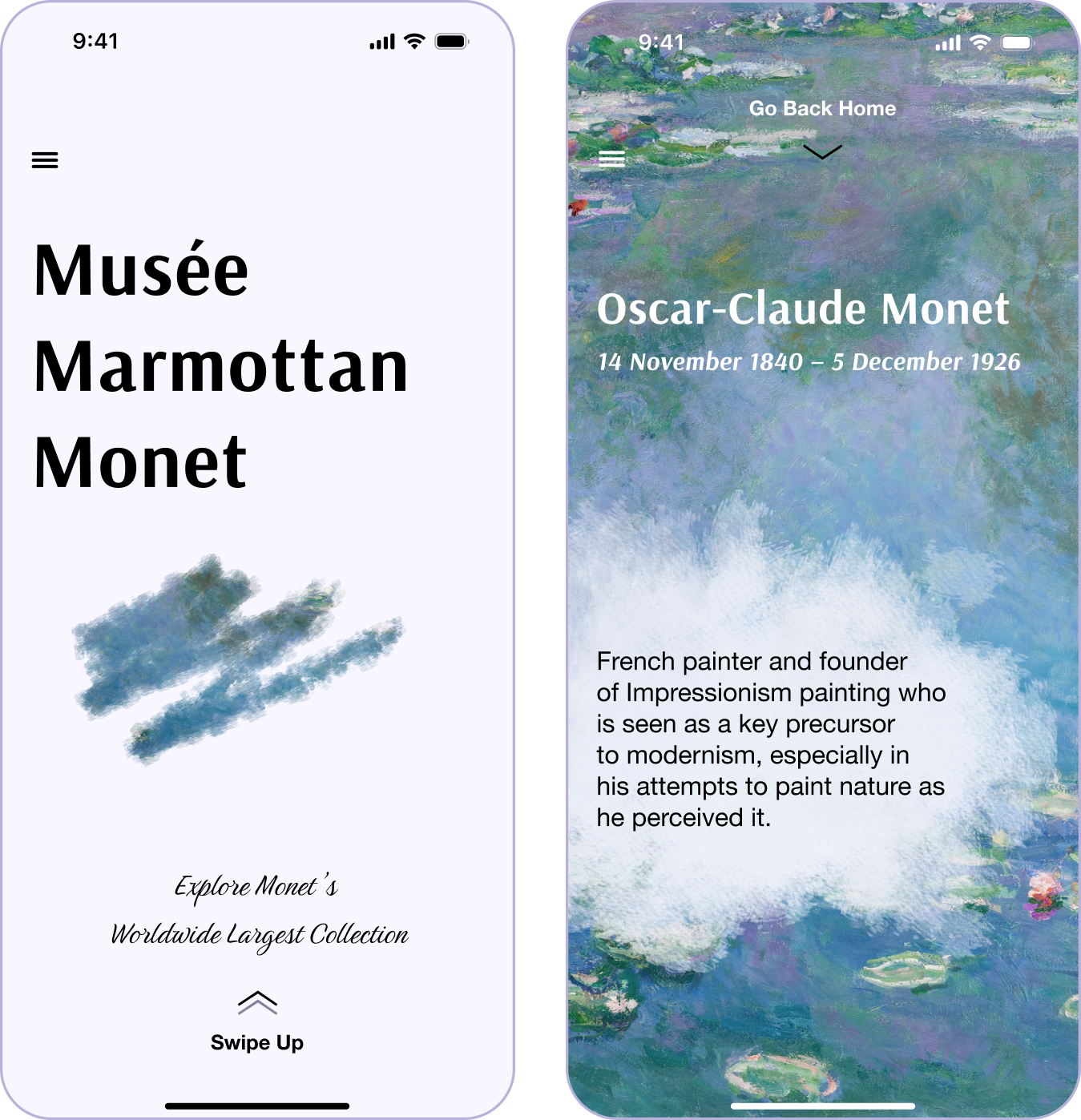
Like painting, a small brush stroke becomes bigger, and the full art piece appears when you swipe up.
Revised design to be more coherent with the overall theme.
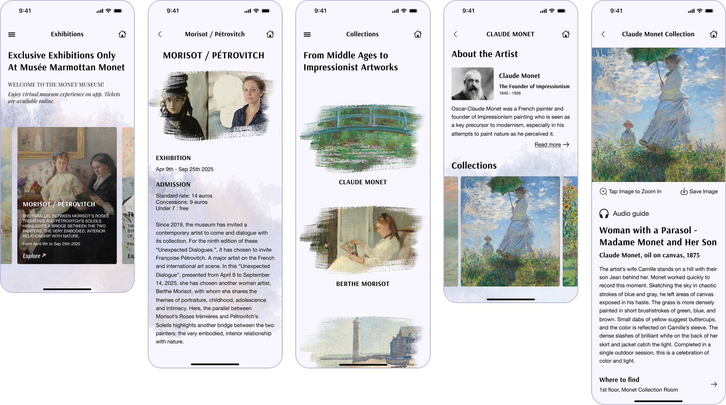
Increased the visibility of artworks and added a carousel and zoom-in animation for better engagement.
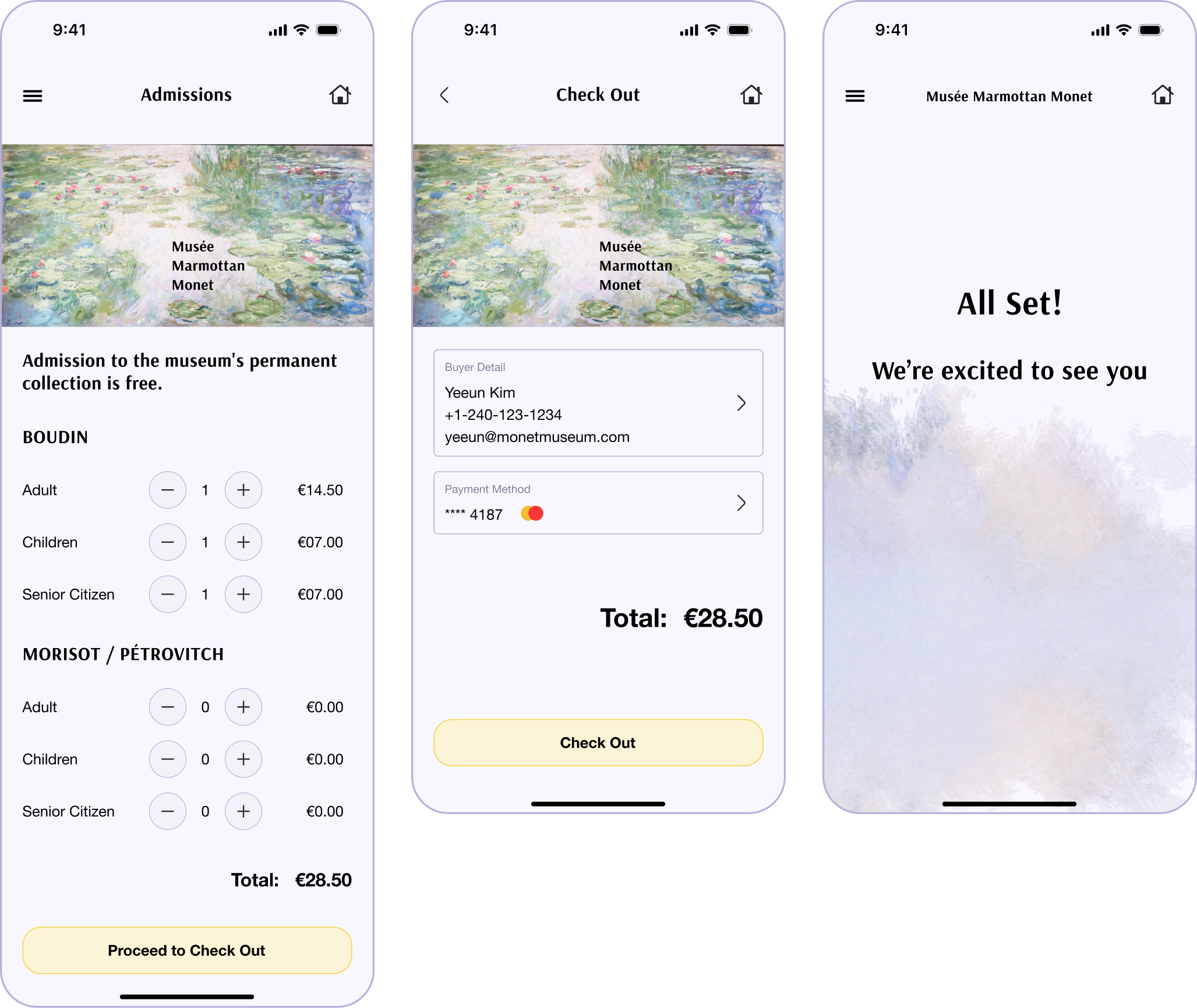
Prioritized a smooth user experience while keeping the overall theme.
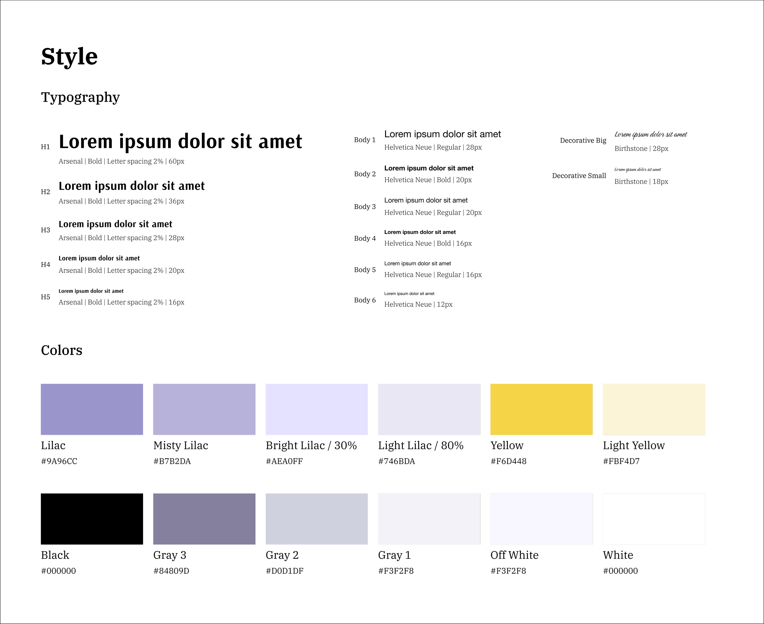
Design System